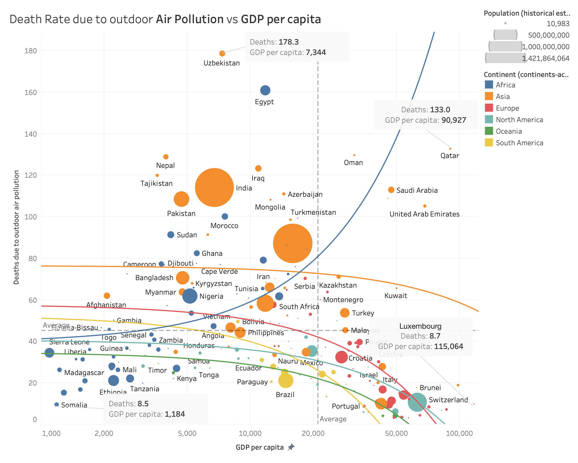
 [OC] Kuznet's curve - Death Rate due to outdoor Air Pollution vs GDP per capita
Submitted by eqqqxy t3_yhdp6x in dataisbeautiful
Ombrynn t1_iudxrxp wrote
It's not beautiful tho. Labels are misleading (for example Switzerland is the micro red dot but feels like the giant unlabeled blue one)
The fitting is way off. there is no clear correlation between GDP and pollution.
Everything is cluttered and hard to read. The size of dots are not explained...
Viewing a single comment thread. View all comments