Recent comments in /f/dataisbeautiful
bob2235 t1_izjbm6s wrote
Reply to [OC] How to spot misleading charts? I would like to hear your opinion on the subject, also any tips design-wise? by dark_o3
I will say one of the first questions I ask people is “what do you want the data to say” because visualization of data can tell whatever story you want it to if the end user isn’t paying attention
HYThrowaway1980 t1_izjb4ep wrote
Reply to [OC] How to spot misleading charts? I would like to hear your opinion on the subject, also any tips design-wise? by dark_o3
I’d actually look at the choice of metric as a key way that data is used to mislead, eg reporting on transactions per hour rather than transactions per staff member, which takes no account of shift patterns, number of staff, etc.
uselessteacher t1_izjau82 wrote
Reply to [OC] How to spot misleading charts? I would like to hear your opinion on the subject, also any tips design-wise? by dark_o3
There are scammers who manipulates axis representations and data selections, then there are honest man who’s using “T” as standard errors bar and tell you the data is just made up.
howtochangename1 t1_izjasy9 wrote
Fuckin vodafone? The sim company?
Penkala89 t1_izjaqxi wrote
Reply to comment by KiR- in [OC] How to spot misleading charts? I would like to hear your opinion on the subject, also any tips design-wise? by dark_o3
"never attribute to Halon that which is adequately explained by a careless typo"
g_spaitz t1_izj8rxm wrote
It's curious that so many on this list are just around the turn of the millennium. Do we have stricter anti-monopolies laws now or big companies don't buy each other out as often?
BestBeforeDead_za t1_izj8o20 wrote
Reply to [OC] How to spot misleading charts? I would like to hear your opinion on the subject, also any tips design-wise? by dark_o3
My only takeaway from studying 1st year statistics at university was that I can confidently not believe any statistics that I see anywhere anytime. Statistics has methods of completely re-representing (is that a word?) the data to the literal opposite of reality, if one simply chooses to do so.
AtLukesDiner t1_izj6wdk wrote
Reply to comment by DevinCauley-Towns in [OC] How to spot misleading charts? I would like to hear your opinion on the subject, also any tips design-wise? by dark_o3
Don't disagree with this nuance!
DevinCauley-Towns t1_izj67t6 wrote
Reply to comment by AtLukesDiner in [OC] How to spot misleading charts? I would like to hear your opinion on the subject, also any tips design-wise? by dark_o3
I would rebuttal this point a bit, since eliminating an axis and replacing it with labels directly on the data points can be an example of improving the data-ink ratio of a data viz, which is generally regarded as a positive in the field.
Edit: Obviously eliminating the axis and having 0 labeling is a no no since the values need to be specified.
Embarrassed-Loss-118 t1_izj3va6 wrote
Reply to [OC] How to spot misleading charts? I would like to hear your opinion on the subject, also any tips design-wise? by dark_o3
Spanish state TV data be like
NovaticFlame t1_izj24fy wrote
Reply to comment by upwaydown in [OC] Largest mergers & acquisitions, inflation adjusted by giteam
I work for one of the spin-offs from that merger. Very interesting indeed lol
NovaticFlame t1_izj22ag wrote
Reply to comment by RedOblivionLW in [OC] Largest mergers & acquisitions, inflation adjusted by giteam
I think you got it backwards. AOL purchased Time-Warner, since they were worth more at the time. But AOL exec’s let them think it was the other way around, since AOL was young and inexperienced. AOL leveraged their high market cap due to the bubble to make a deal.
Source is from The Fifth Wave. Great read if you ever have time!
YarrowBeSorrel OP t1_izj21c2 wrote
Reply to comment by mkaszycki81 in [OC] Impacts of White-tailed Deer Reproductive Seasonality and Vehicles Collisions in Wisconsin by YarrowBeSorrel
This color scheme was chosen as its color blind safe. I can toy around with your idea too.
KinkyHuggingJerk t1_izj1dm1 wrote
Reply to comment by IONIXU22 in [OC] How to spot misleading charts? I would like to hear your opinion on the subject, also any tips design-wise? by dark_o3
It's usually less about what the starting Y value is as it is about the scaling for the overall data, coupled with a plot point to close to the starting y value.
I mean, people should be able to critically think through this, but if that were the norm, we would probably have flying cars robot slaves better living conditions less bullshit to deal with.
BurnedStoneBonspiel t1_izj0xec wrote
Reply to [OC] How to spot misleading charts? I would like to hear your opinion on the subject, also any tips design-wise? by dark_o3
On the second table why is there even a need for a y2 axis on the right table?
usually a secondary axis is better is the units of measure are different between y1 and y2
ellWatully t1_izj0kk4 wrote
Reply to comment by MeltBanana in [OC] How to spot misleading charts? I would like to hear your opinion on the subject, also any tips design-wise? by dark_o3
I was thinking the same thing. Having two y axis scales left and right is only misleading if the two sets of data are displaying the same information for different groups. If they're displaying two different attributes of a system, different axes are often the only way to make the plot useful.
MamboPoa123 t1_izj0j6k wrote
Reply to comment by dark_o3 in [OC] How to spot misleading charts? I would like to hear your opinion on the subject, also any tips design-wise? by dark_o3
Would be useful to highlight where the difference is - I knew where to look from the titles but someone else might find it confusing. I'd also consider using colors or stronger dividers, something to show the different vertical sections.
upwaydown t1_izj0f0z wrote
The Dow/DuPont merger was an odd one. Had to do a case study on it in college, worth the Google search.
marsman t1_izj00gg wrote
Reply to comment by MrMitchWeaver in [OC] How to spot misleading charts? I would like to hear your opinion on the subject, also any tips design-wise? by dark_o3
>These are all expressed in percentage points but they have wildly different ranges and magnitudes. It would make no sense to use one single axis for two or more of those.
And importantly, there is the potential for trends to be highlighted by that sort of chart that wouldn't otherwise be visible, and that are accurately reflected in the data (so its not a manipulation).
marsman t1_izizrmv wrote
Reply to comment by MrMitchWeaver in [OC] How to spot misleading charts? I would like to hear your opinion on the subject, also any tips design-wise? by dark_o3
3 is fine if the period covered is the relevant period, it's not fine if you are trying to display a continuous trend. It could be problematic, or fine if you are showing a point of change where the previous period isn't relevant (so you aren't after a change in trend from a previous period).
marsman t1_izizcu7 wrote
Reply to comment by Korwinga in [OC] How to spot misleading charts? I would like to hear your opinion on the subject, also any tips design-wise? by dark_o3
It's often true if you want to show the differences between similarly (usually large..) numbers. Whether it is misleading or not tends to be in the presentato and context. The same applies to things like log scales etc...
MrMitchWeaver t1_iziz6qy wrote
Reply to comment by Stannic50 in [OC] How to spot misleading charts? I would like to hear your opinion on the subject, also any tips design-wise? by dark_o3
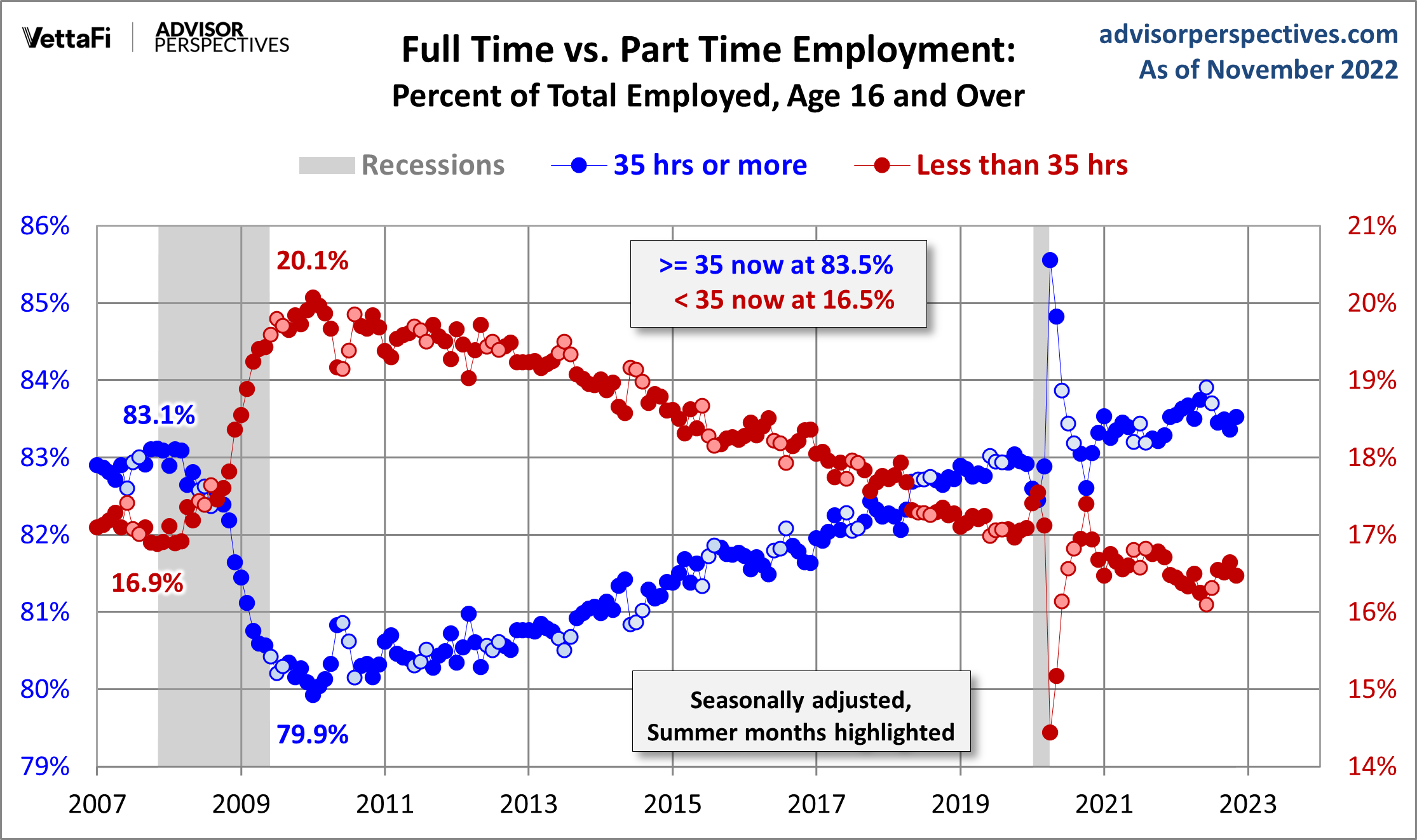
Here's a great example I just ran into https://www.advisorperspectives.com/images/content_image/data/a3/a310f2c1738037eb2e55deb0b7a54134.png
mkaszycki81 t1_iziz51r wrote
Reply to [OC] Impacts of White-tailed Deer Reproductive Seasonality and Vehicles Collisions in Wisconsin by YarrowBeSorrel
May I suggest a different color scheme? Light yellow for noon, going to red for the afternoon, purple for evening, dark blue for midnight and then lighter shades of blue for closing to morning, and yellow for early day?
It would be more intuitive.
[deleted] t1_iziy9fj wrote
Reply to comment by MrMitchWeaver in [OC] How to spot misleading charts? I would like to hear your opinion on the subject, also any tips design-wise? by dark_o3
[deleted]
Figgybaum t1_izjcvde wrote
Reply to comment by uselessartist in [OC] Largest mergers & acquisitions, inflation adjusted by giteam
10 out of the 20 biggest mergers ever happened in 1998,1999,2000