 [OC] Number of medical schools in South America
Submitted by BlitzOrion t3_zh4e9a
/f/dataisbeautiful
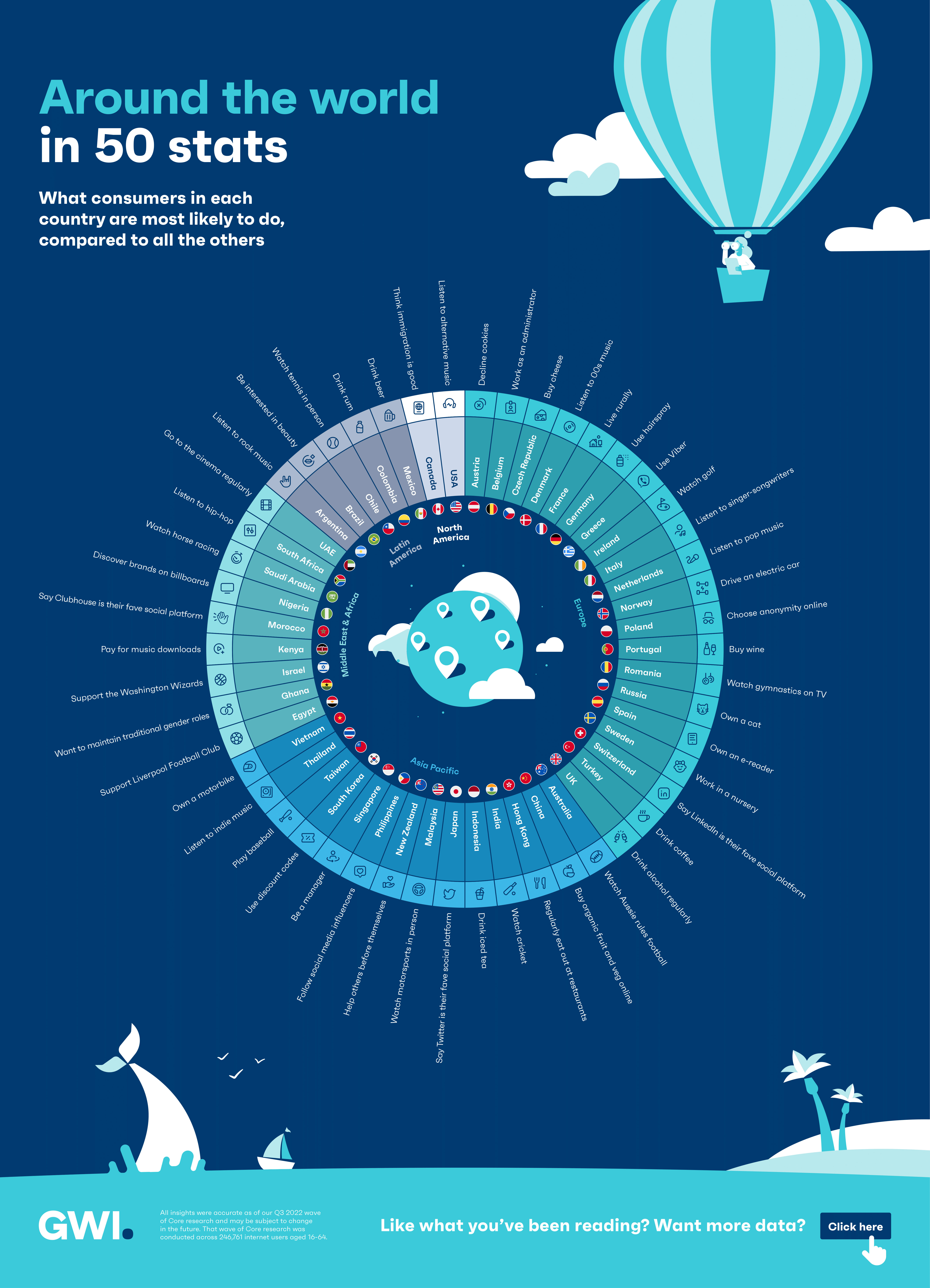 [OC] Mexican beer and New Zealand’s selflessness: the most distinctive traits and behaviors of 50 countries around the world
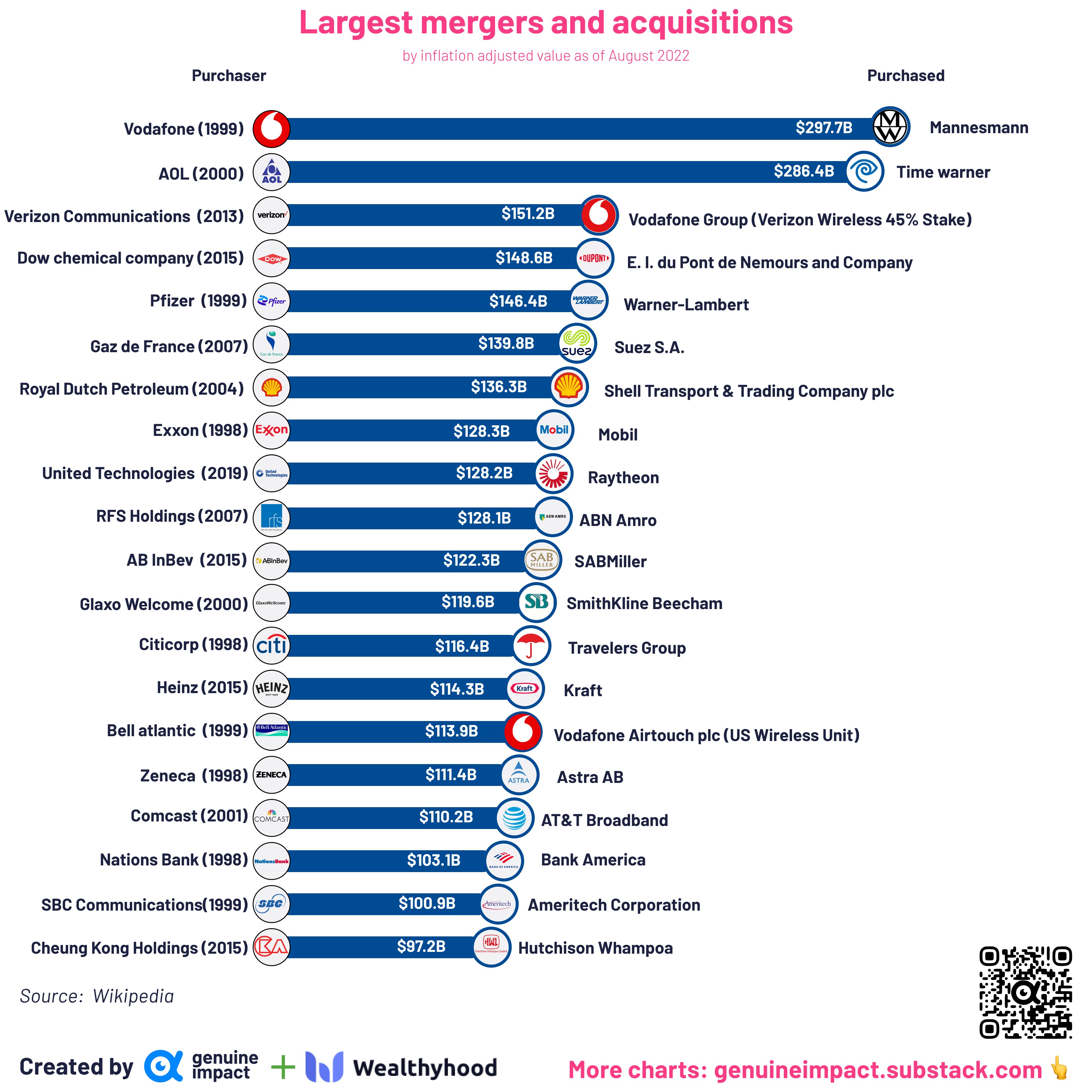 [OC] Largest mergers & acquisitions, inflation adjusted
Submitted by giteam t3_zgt8ye
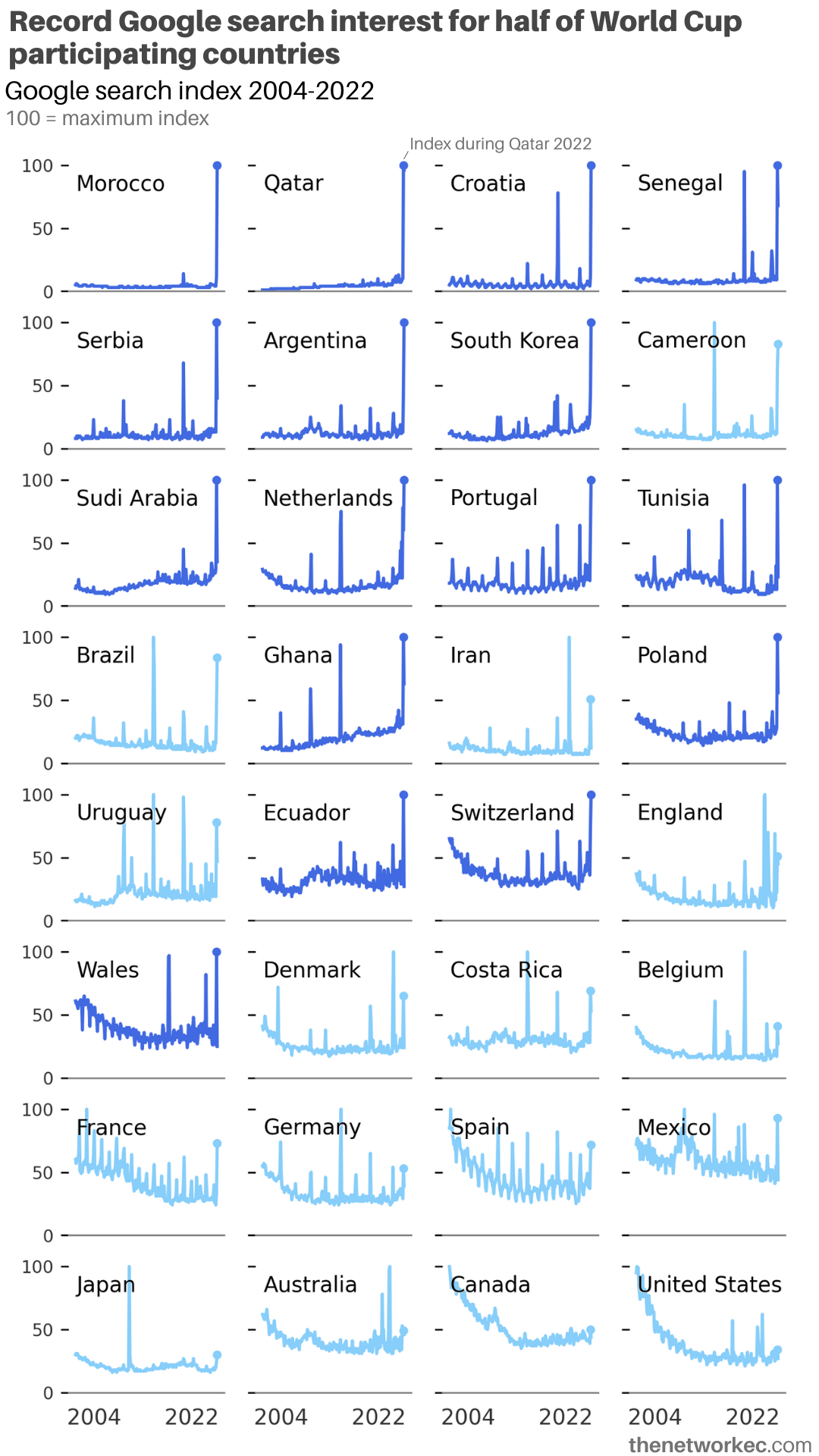 [OC] The World Cup makes people google participating countries like no other event
Submitted by veleros t3_zyaiul
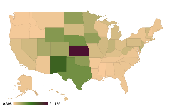 Percent (x100) Change in Renewable Energy Usage by US State from 1990 to 2020 [OC]
Submitted by Time_Crystals t3_zgfo95
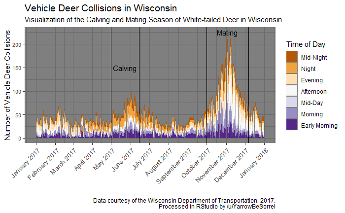 [OC] Impacts of White-tailed Deer Reproductive Seasonality and Vehicles Collisions in Wisconsin
Submitted by Radikiyo t3_zyonk1
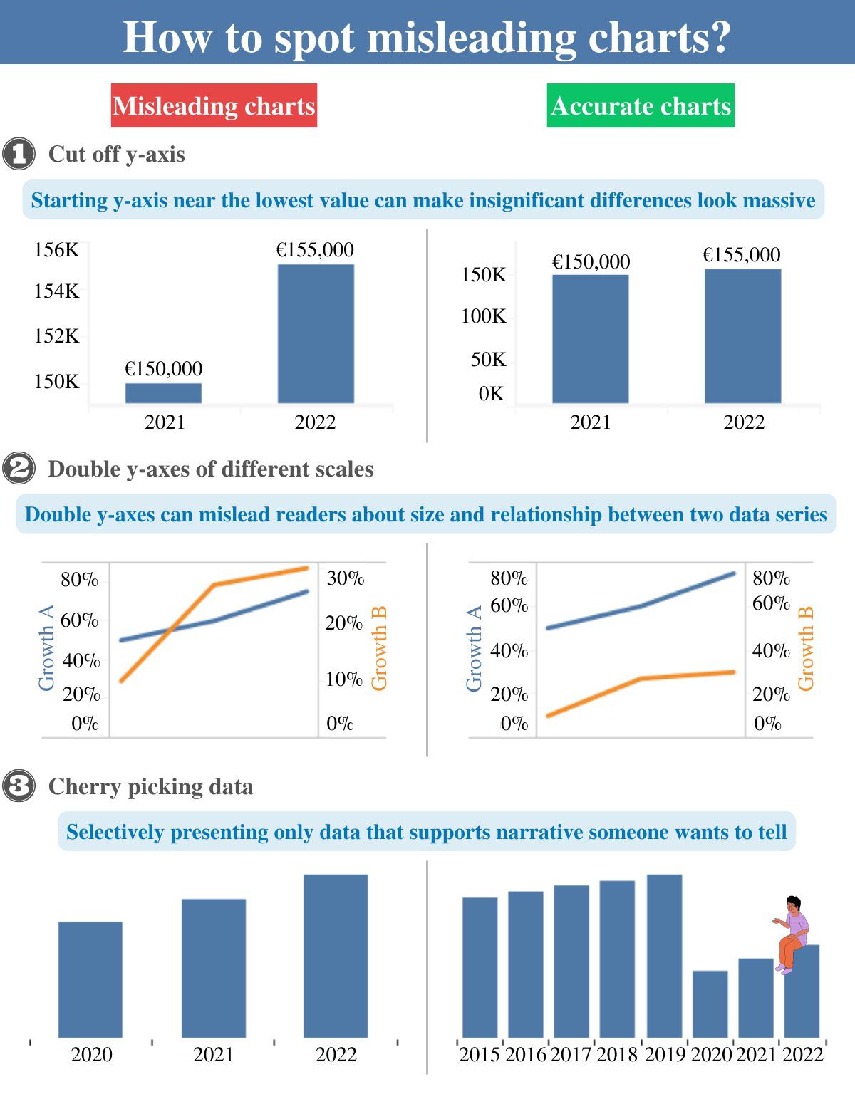 [OC] How to spot misleading charts? I would like to hear your opinion on the subject, also any tips design-wise?
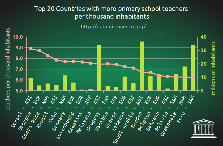 [OC] Top 20 countries with more primary school teachers per thousand inhabitants (2021)
 [OC] USA Median Listing Price for Homes by County, Percent Change, November 2021 to 2022, Realtor.com Residential Listings Database
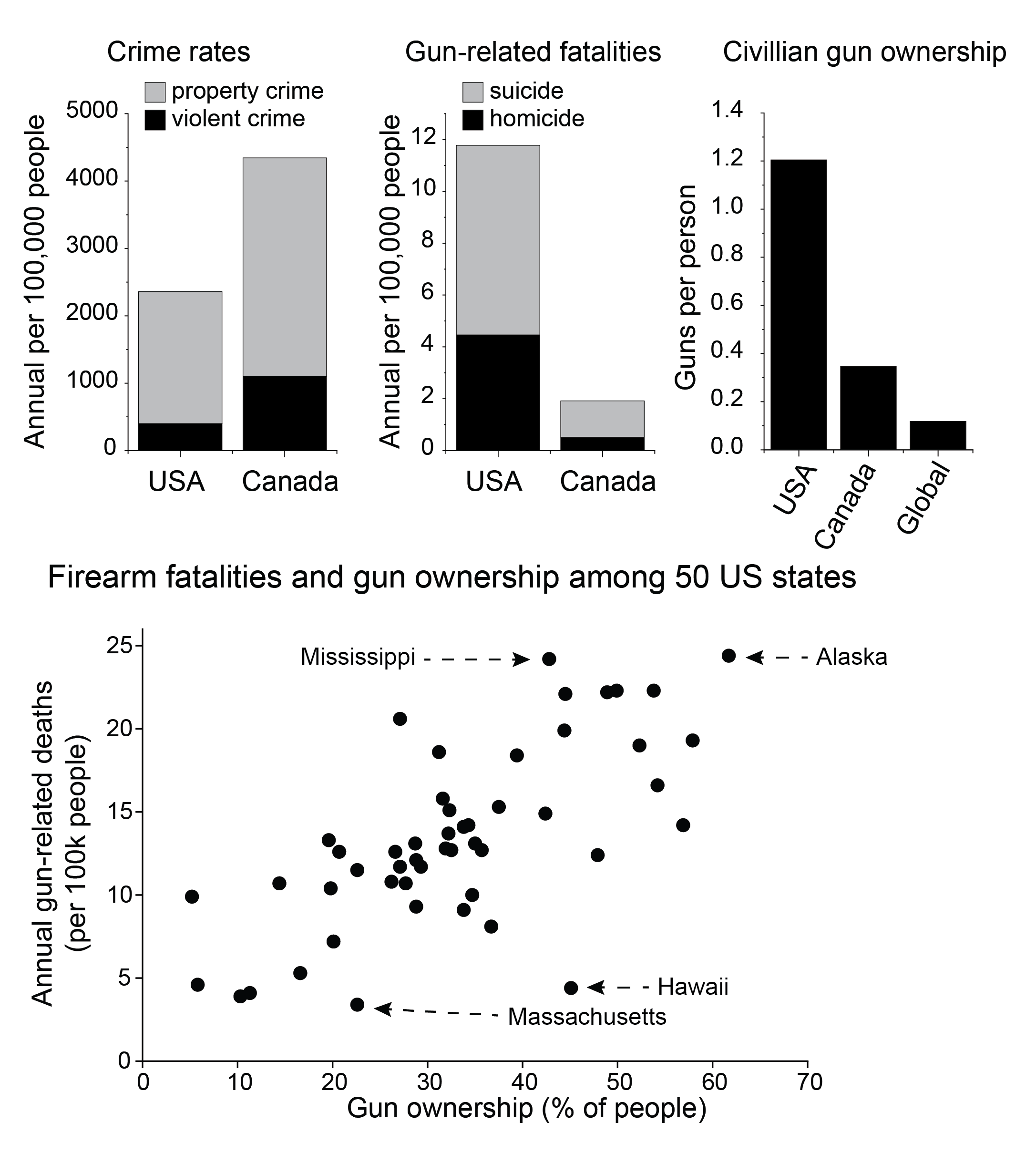 [OC] Guns in the US and Canada
Submitted by pigecoin69420 t3_zfz3zx
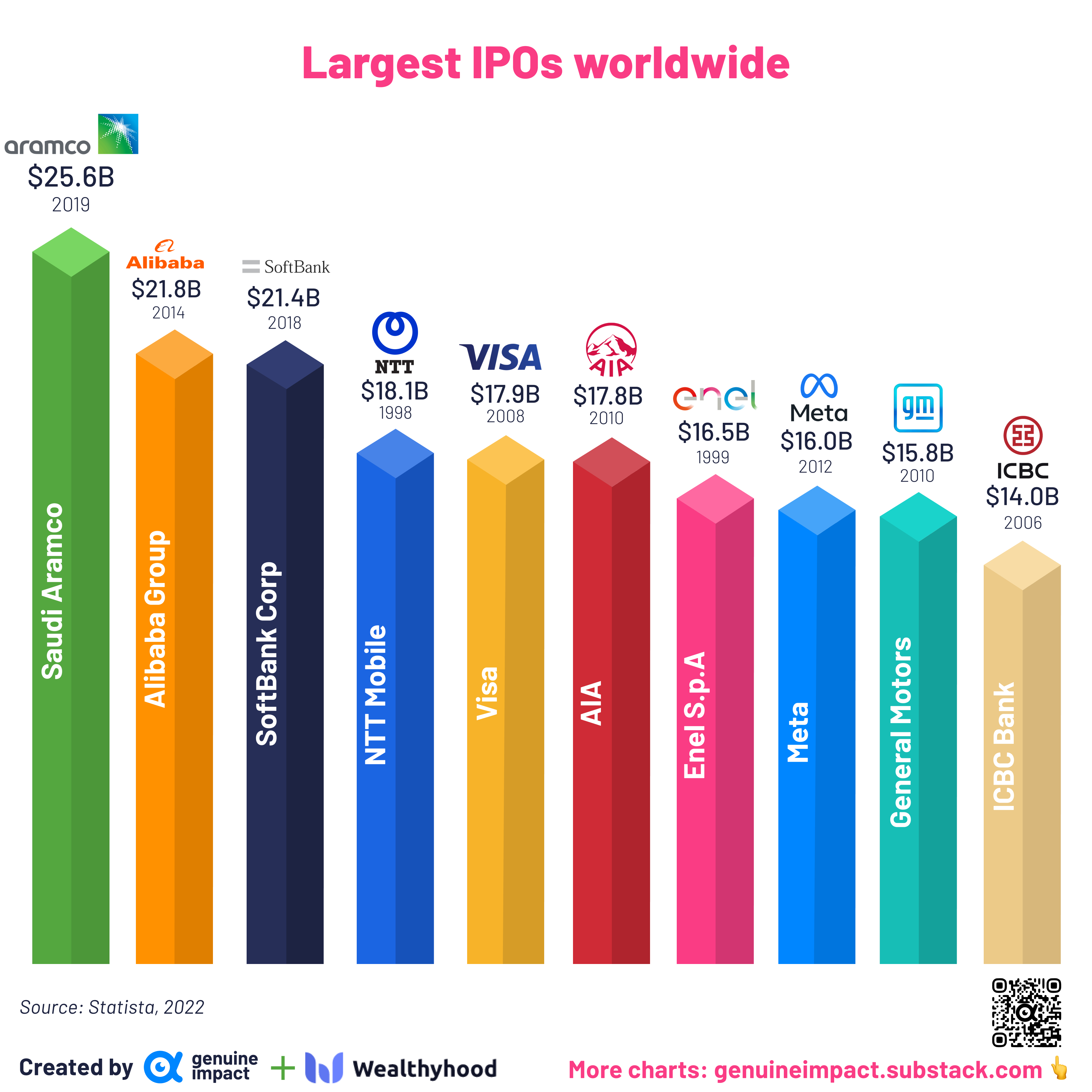 [OC] Largest IPOs in history
Submitted by giteam t3_zfuvxp
 Change in electricity produced by renewables per continent 2012-2022 [OC]
Submitted by hcrx t3_zfu1xq
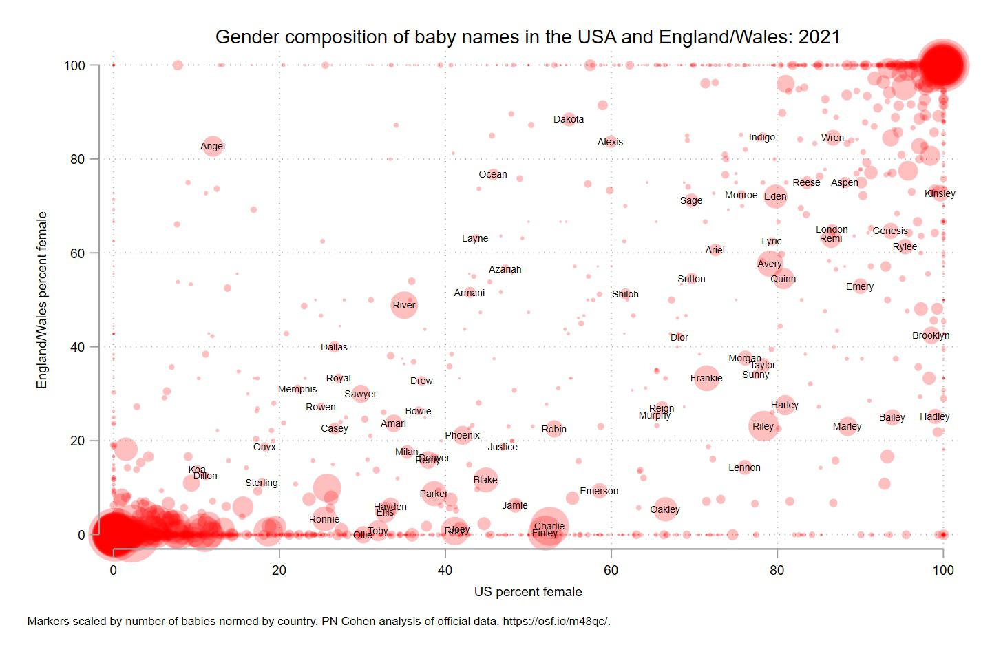 Sex composition of baby names in the USA and England/Wales: 2021 [OC]
Submitted by pncohen t3_zff7ih
Great article using data to show the rise in Covid misinformation on Twitter. If there was no groundswell of coordinated misinfo on Twitter, this chart would be full of disconnected dots. Data and graphs supplied by Timothy Graham of the Queensland University of Technology
abc.net.auSubmitted by pedrointas t3_zfdrpq
Submitted by all_of_the_lightss t3_zfdll5
 Swans: The ultimate gift from your true love [OC]
Submitted by TrueBirch t3_zfcoks
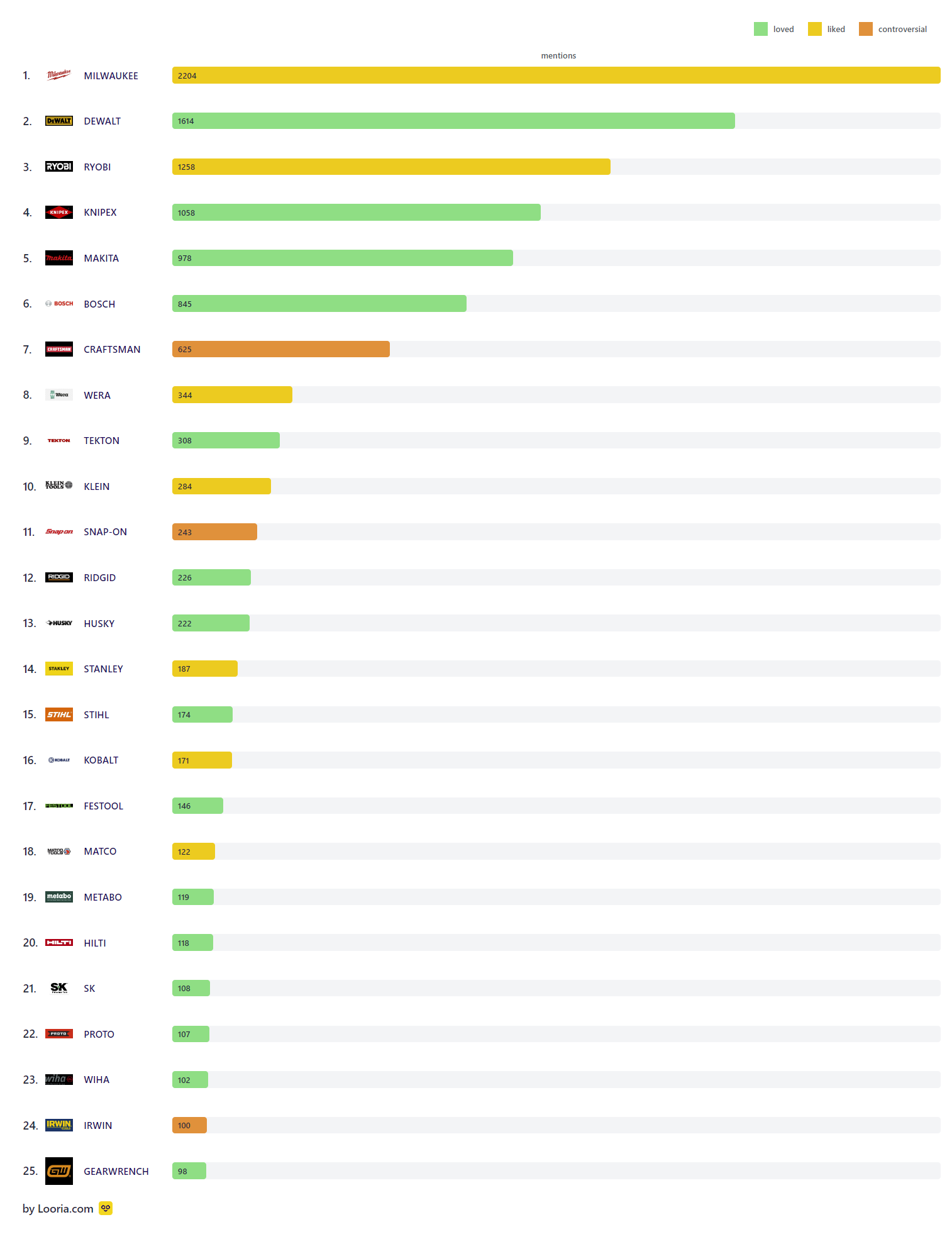 [OC] The most popular tool brands on Reddit 2022 (r/Tools)
Submitted by madredditscientist t3_zf8j7x
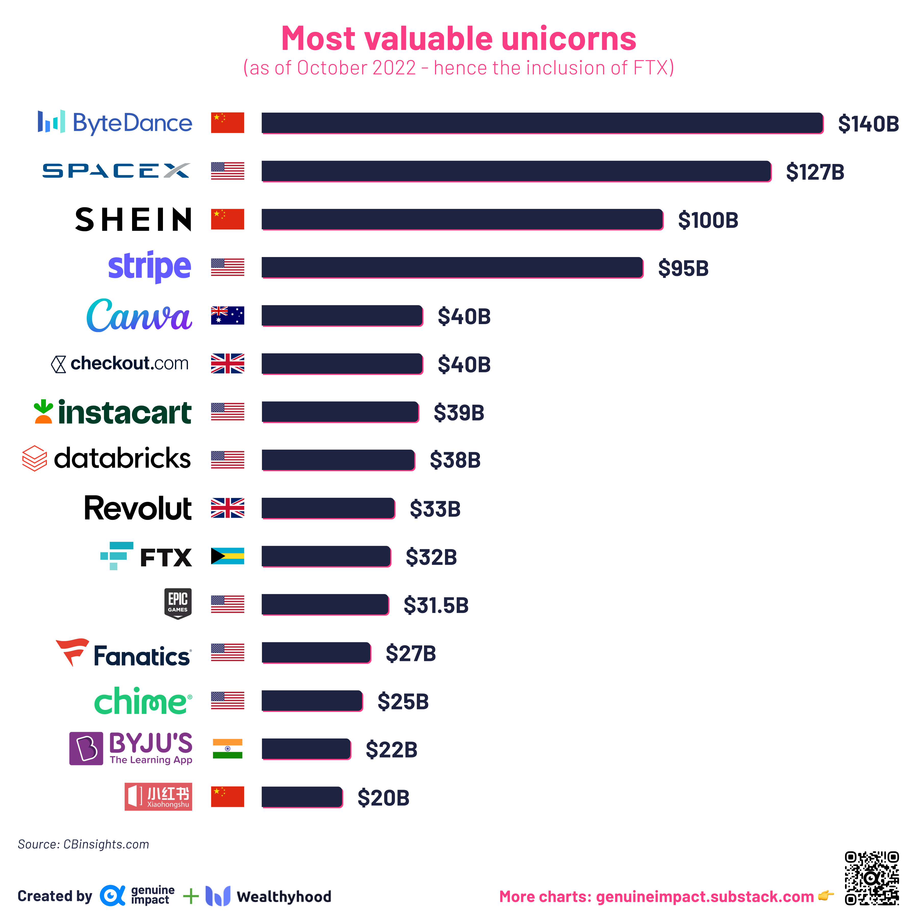 [OC] World's most valuable unicorns (data from October, so FTX is still there)
Submitted by giteam t3_zf4nyo
 [OC] Visualizing the Latin American migrant population in Europe.
Submitted by latinometrics t3_zf0oq8
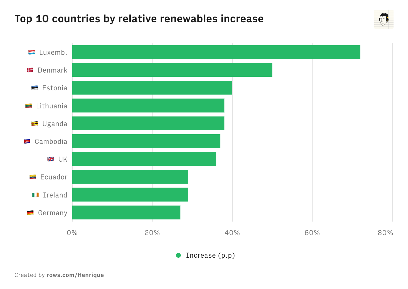 Top 10 countries by relative renewables increase 2012-2022 [OC]
Submitted by hcrx t3_zexbri
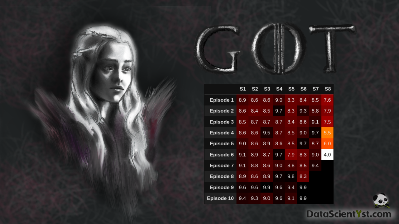 [OC] Game of Thrones - user ratings s8 - worst, e9 best
Submitted by OwnComplex9907 t3_zeu725
 [OC] References to Meat in the Movies over the Decades
Submitted by Aggressive-Ad7843 t3_zer0bq