 [OC] World Top-30 in payment of taxes as a proportion of GDP (2020)
Submitted by UsandoFXOS t3_zxrfng
/f/dataisbeautiful
Great article using data to show the rise in Covid misinformation on Twitter. If there was no groundswell of coordinated misinfo on Twitter, this chart would be full of disconnected dots. Data and graphs supplied by Timothy Graham of the Queensland University of Technology
abc.net.auSubmitted by pedrointas t3_zfdrpq
 [OC] Breakdown of Tradescantia plant cultivar names by validity and which species they belong to
Submitted by Broad-Vacation-642 t3_yf1gme
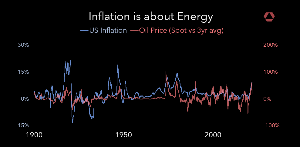 Oil v. US Inflation [OC]
Submitted by rosetechnology t3_xwddlc
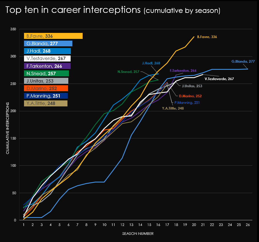 [OC] Charting season-by-season accumulative interceptions for the top ten career leaders, led by all-time interception king Brett Favre (NFL, American Football)
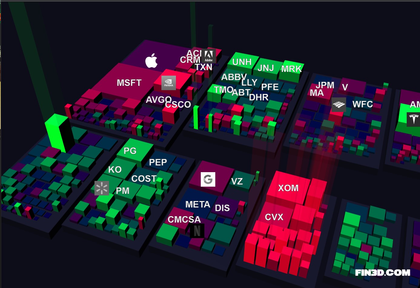 [OC] Fin3D.com - S&P 500 market data visualized in 3D
Submitted by Rockclimber88 t3_11k5rk8
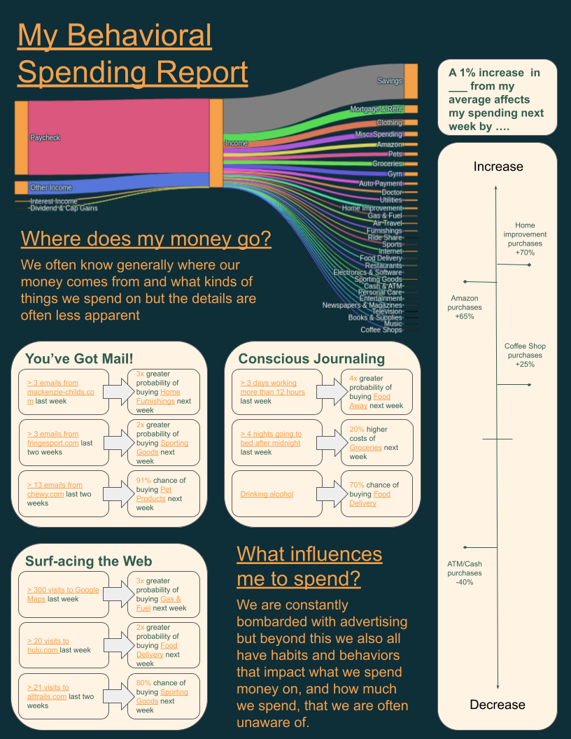 [OC] How my behaviors and external influences impact my spending
Submitted by thehallmarkcard t3_111fuza
 [OC] x-position of joints on a pig as it walks on a treadmill as a function of time
Submitted by nickgiorgio t3_10sotrk
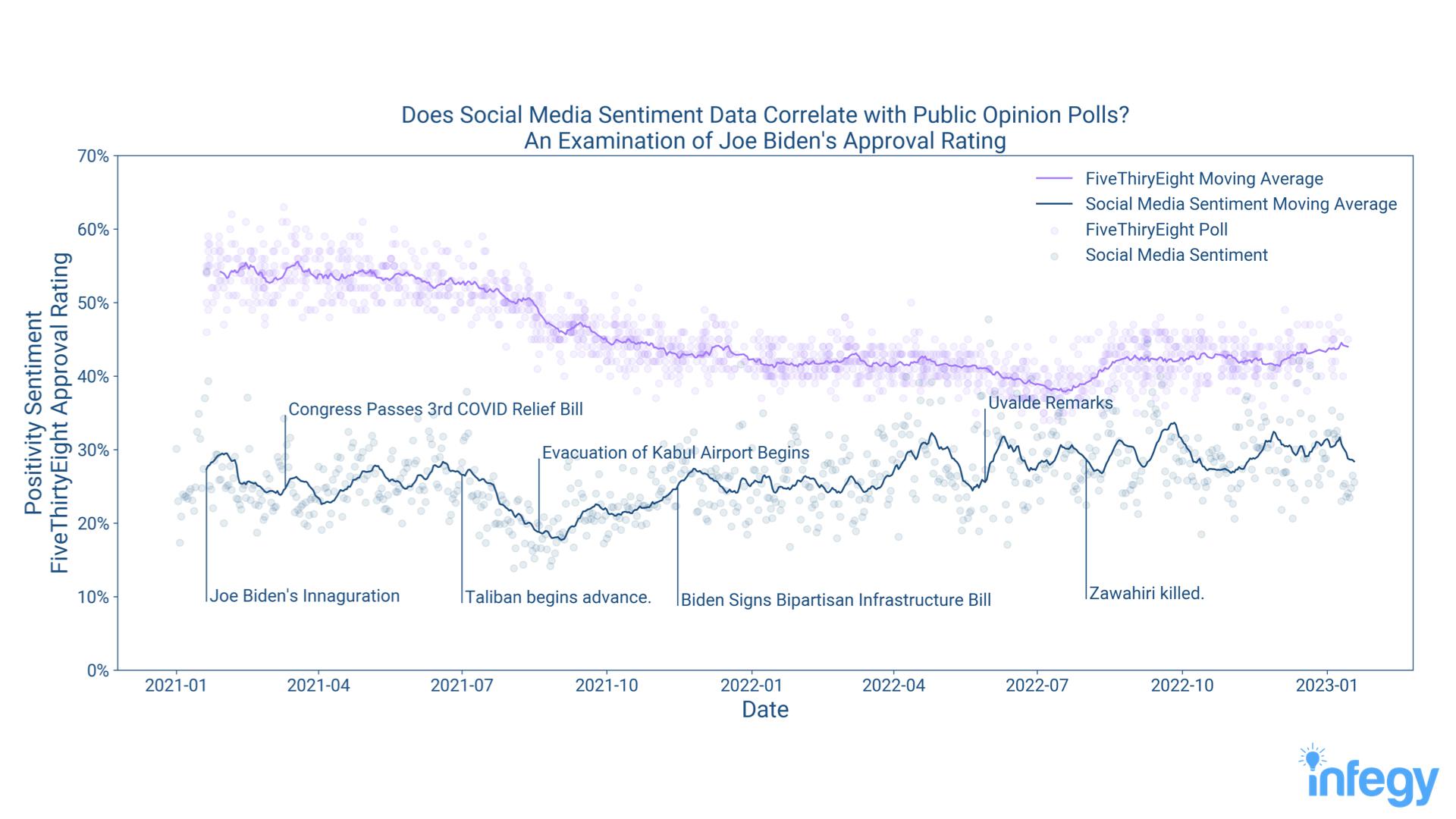 [OC] Joe Biden's Aggregate Social Media Sentiment Compared with FiveThirtyEight's Polling Average
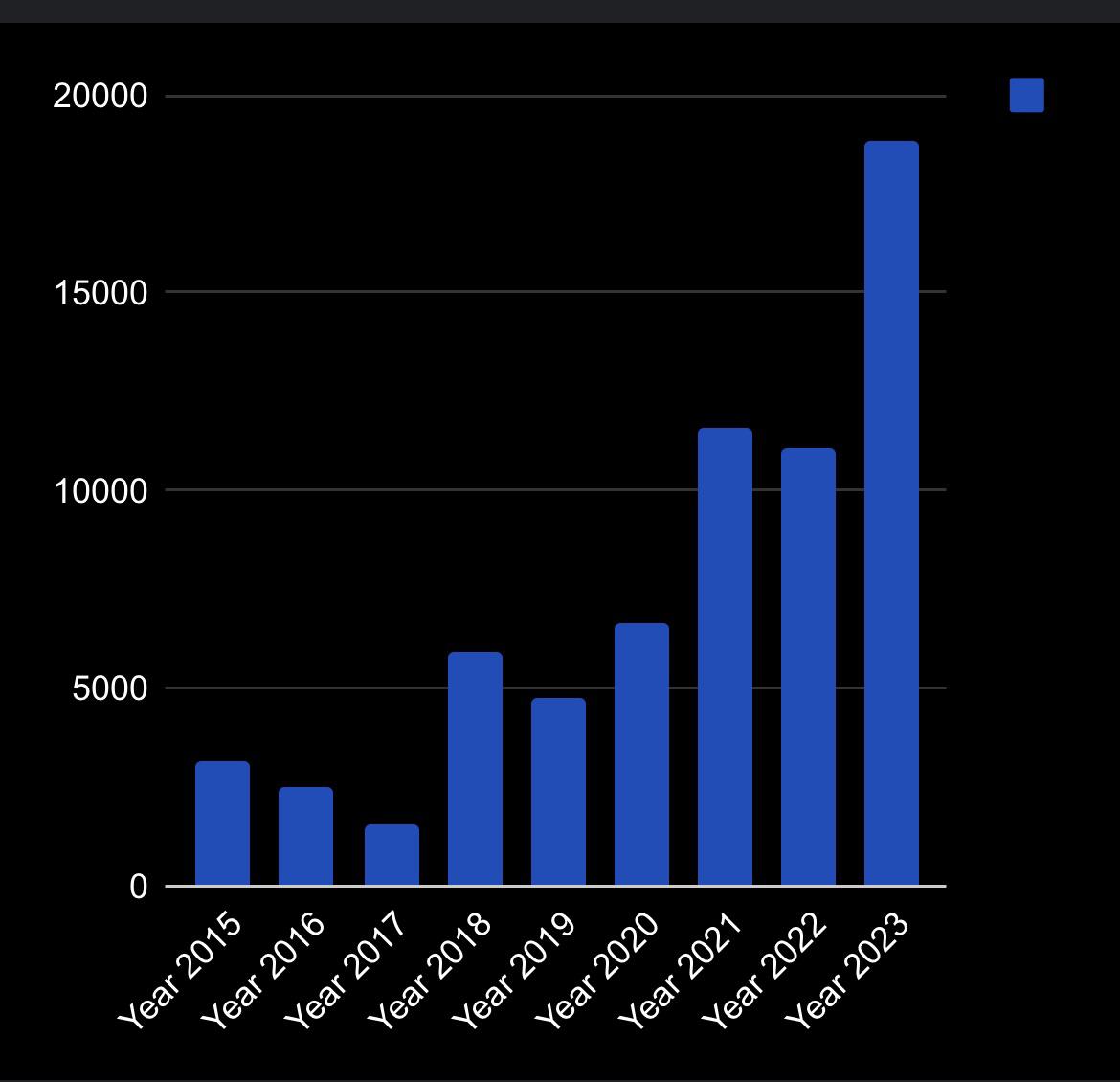 [OC] Money I had (in pounds) at the start of each year, starting from 2015
Submitted by Autistic-Inquisitive t3_1018u1q
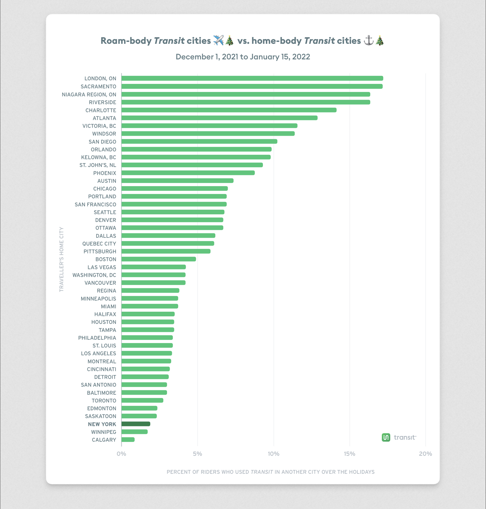 [OC] The cities most (and least likely) to travel elsewhere for Christmas
Submitted by baronbendigo t3_ztppar
 [OC] Number of medical schools in South America
Submitted by BlitzOrion t3_zh4e9a
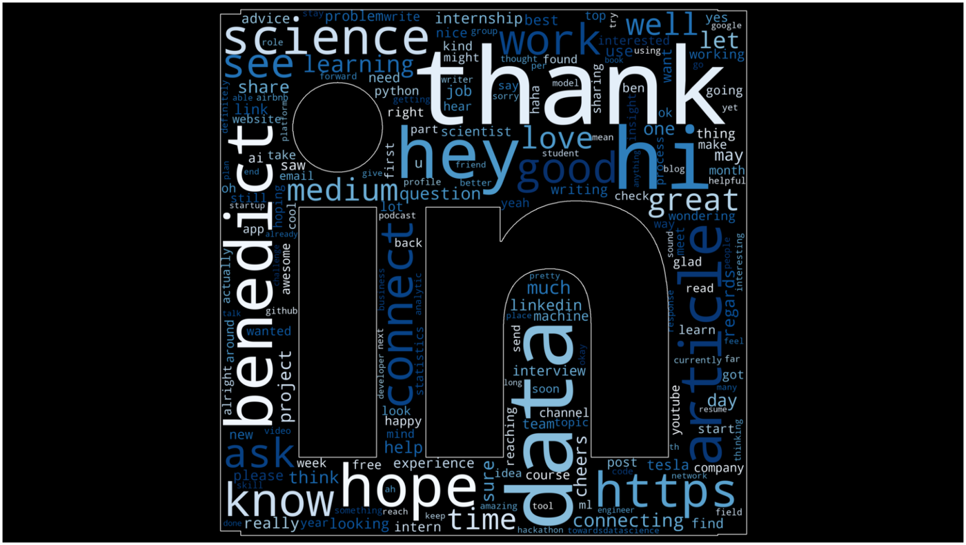 [OC] I made a word cloud of my LinkedIn messages
Submitted by benthecoderX t3_y6nqk0
 Created this viz for Pizza Plaza, suggestions & feedback are welcome! [OC]
Submitted by itsmeyohacker_0811 t3_xyuuk7
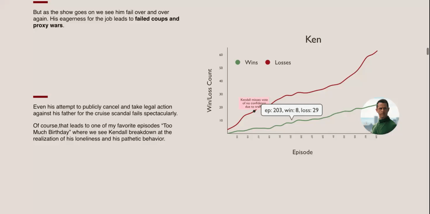 [OC] I figured out who is going to win Succession using data viz: https://riagarg.github.io/succession-viz/
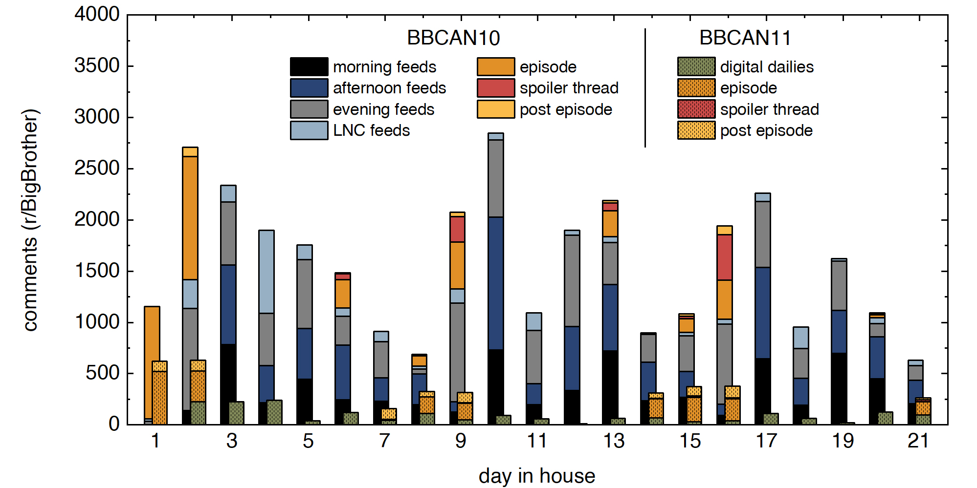 [OC] How Big Brother Canada murdered my favorite subreddit (r/BigBrother)
Submitted by FlippantBuoyancy t3_125evdg
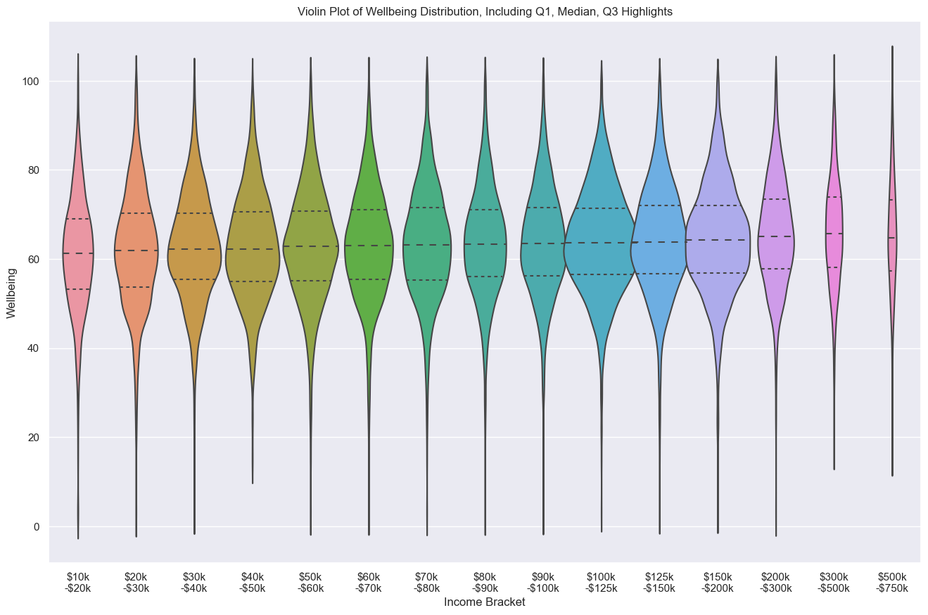 [OC] Well-being Distribution based on Income Bracket in the US
Submitted by ketzu t3_11pdcuq
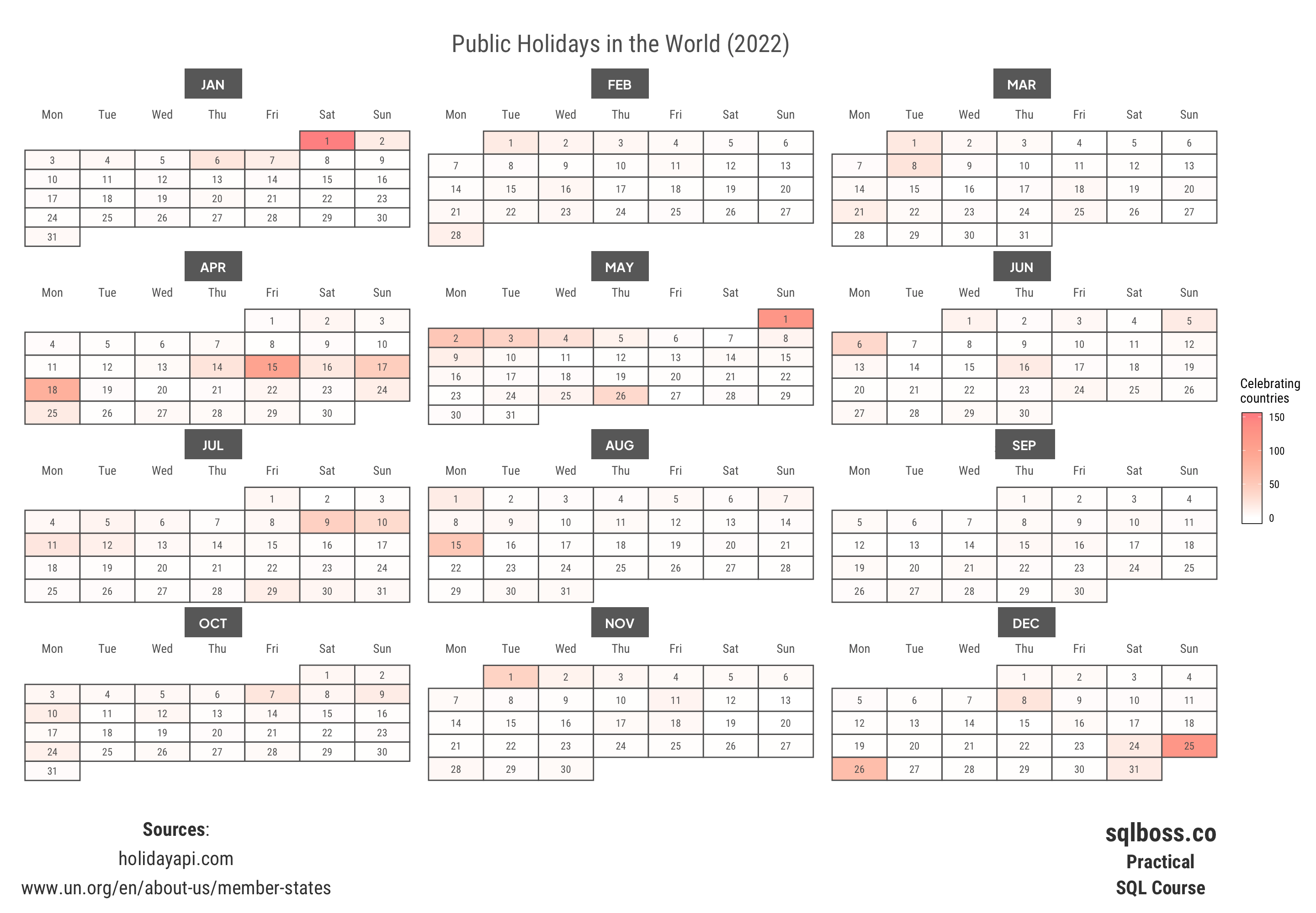 [OC] Public Holidays in the World in 2022: New Year's Day, Christmas, Labor Day are in the top 3.
 [OC] Programming Language Popularity: Reddit vs. TIOBE
Submitted by whatweshouldcallyou t3_10y6stf
Submitted by abercravest t3_102smbw
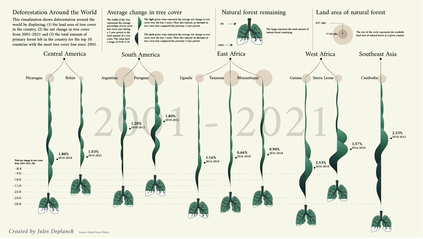 [OC] Deforestation visualized
Submitted by LGFBOOM t3_10ltjip
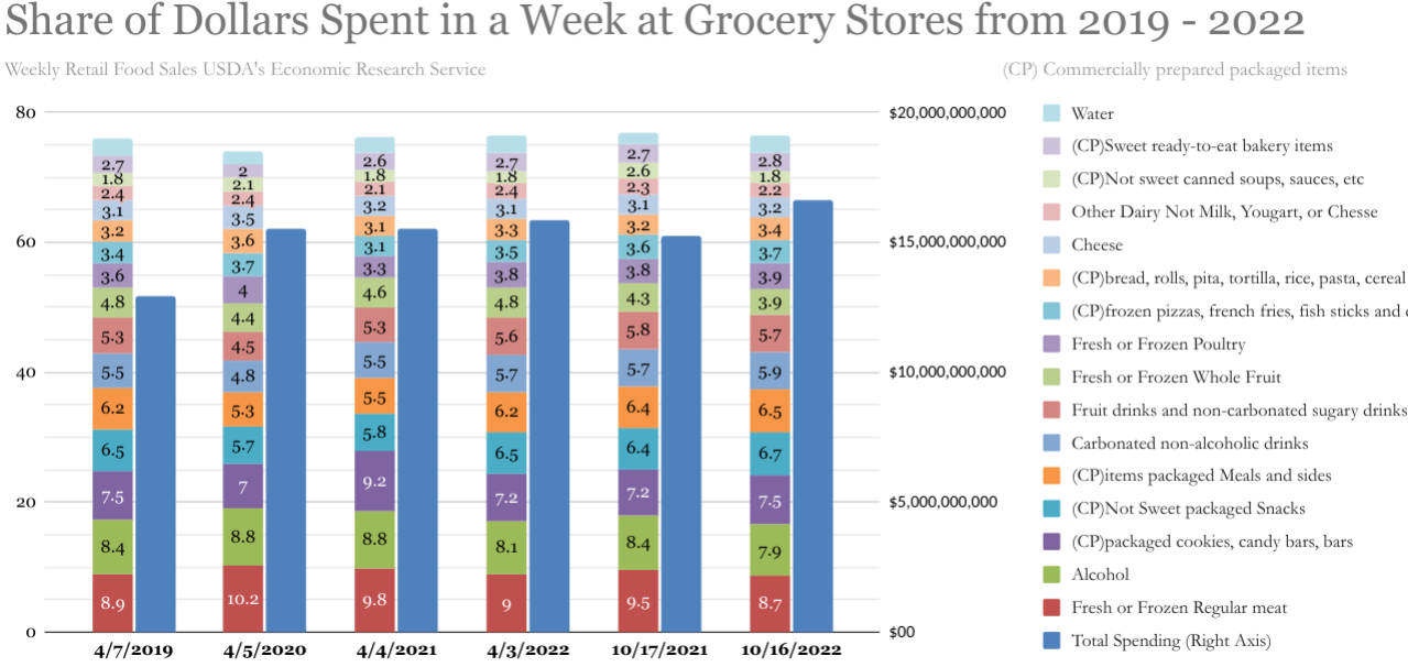 [OC] What Impact has Covid and Inflation had on Grocery Shopping Trends in the US from 2019 - 2022
Submitted by all_of_the_lightss t3_zfdll5
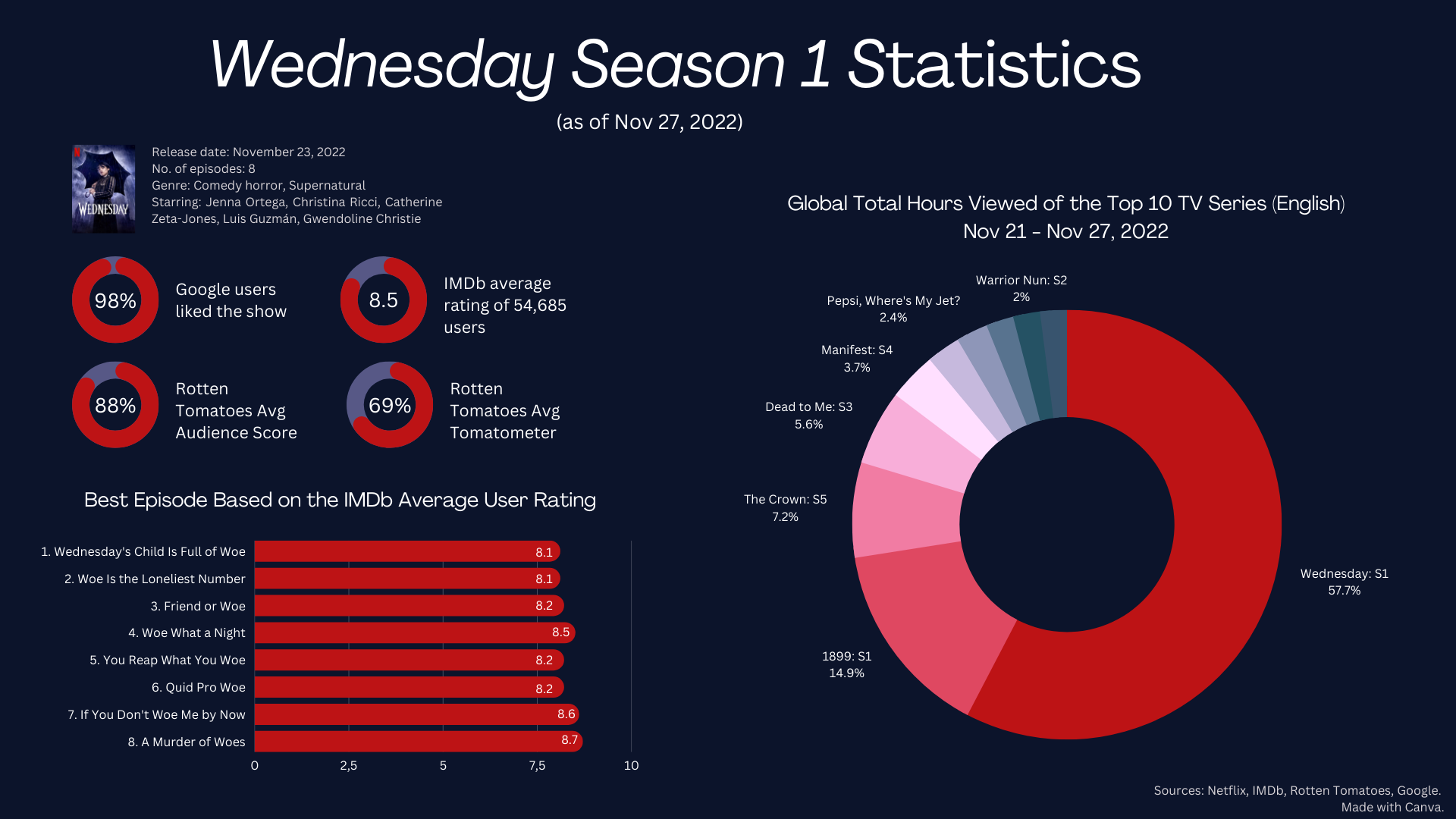 [OC] Netflix's "Wednesday" Global Viewing Statistics, Nov 23 — Nov 27, 2022
Submitted by CheetahOk8221 t3_z9nbre