 Curious to know what folks think about this messaging?
Submitted by Johnny9Toes t3_zbqdku in vermont
ties__shoes t1_iyt3ax3 wrote
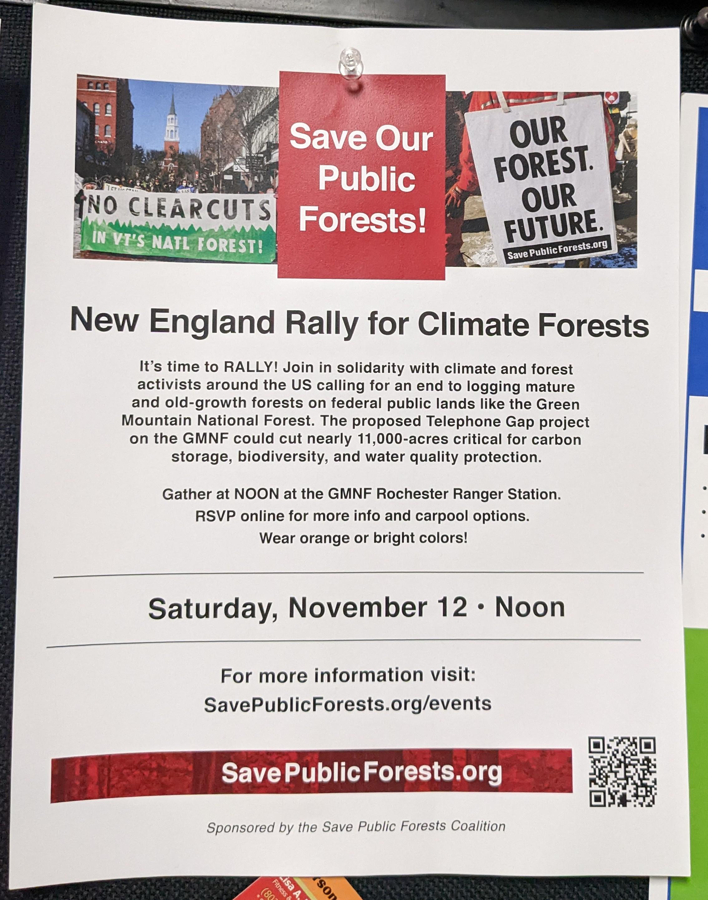
I think it would work better with fewer pictures on the top. Maybe one photo in a banner? I think the main body of text is too small and too long. The double web page call out at the bottom is a little strange. That said I think it looks balanced and that the designer broke up the space well. Although there are too many photos the inclusion of visuals is great.
Johnny9Toes OP t1_iyuet54 wrote
This is an unexpected reaction and I am totally in favor of it. Tip of the lid to you. Not enough critique of graphic design these days.
Viewing a single comment thread. View all comments